A cyanotype is done by blocking out certain areas on the photo-reactive paper, leaving the rest of the paper to be exposed in sunlight and will turn the iconic blue of the cyanotype. This technique was used to produce blueprints before printing was an easy thing to achieve, hence the bright blue colour they always had. I tried out this technique using leaves and sunlight originally, which took a number of hours to expose. With the technology available in uni, this whole process can now be done in a matter of minutes, rather than waiting hours and hours for a possibly unsuccessful print, as the results of these can be quite unpredictable. I printed my images out after editing them on Photoshop, I made them black and white, contrasted, and then inverted, to produce a negative image which was then printed out on see through acetate paper.
I used this over the freshly painted paper and fabric, which had been painted with the cyanotype solution that when dry will expose to light, and put them to expose in a UV machine for 7 minutes. The paper ones came out quite good, the colours came out strong and I tried both a positive and a negative.
The positive came out very strong and realistic looking which I think has worked well. The negative came out softer but quite interesting looking, I did find that whil the solution was being washed off of it, it was also washing away a layer of the paper too so I had to be careful to not completely destroy the print while washing it. If left unwashed, the green solution would have carried on developing into the blue so it has to be washed a lot. I also tried some more paper ones which I decided to draw into with fineliner which has created quite an interesting finish on them, although this would be more difficult to do on fabric.
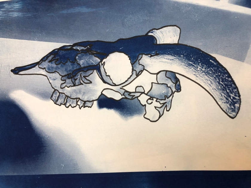
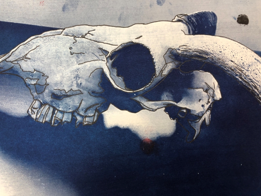
I do think these turned out quite well although I think the thinner lines are far more effective than the thicker lines as I am able to go along much more fine lines. Up close here too it is easier to see the gradient of colour and shading within the image which I thought was very interesting, and one of the reasons why I like cyanotyping, the fact that using just the blue over white paper can achieve such a photographic quality. Similar to photograms, traditional photography practices are something that I really enjoy working with.
These two show the examples I created on paper and fabric, the first image is the paper one, where I clearly did not apply the developer in the first stages very well so it was left streaky, although with this technique perfection is hard to achieve so I tend to embrace the imperfections in the images and turn them into something I like about it. I feel like to improve this one I could try cutting holes through it or sewing into it, as I feel like it would make it a little bit more interesting than looking like a mistake. The second image shows the fabric prints, which all came out quite well in form and shape, however it is easy to see the colour is not as strong here even though I left the exposure unit on for longer. I think if I was to do this again I would have to leave it exposed for longer again to really try and get the richness of colour that I wanted. I would also take the time had I had more of it to test out different types of fabrics to see both how the colour turned out, as well as the design of it.
I think the next step would be to stitch into a paper and a cyanotype sample as I feel like this would be a good point to start developing the designs I am already happy with.