Digital Print

I was keen to start digital printing as I felt like my patterns had improved to a good enough quality to be able to see my designs on fabric. we were told our two A4 would be printed on two types of fabric;cotton, satin. For whatever reason my designs were only printed on satin, which produced some problems for me with showing and displaying my work. The colours were wrong and bled through the fabric even colours from other peoples designs which i had not incorporated. It was also printed wonky and creased which I think ruined the appearance of my designs, when I finally got to see them on the cotton I saw the designs were much brighter and sharp, overall more successful. However the designs had not been washed yet so were not the final designs.

Had I possibly had more time for this module I would have taken my designs to be printed somewhere professionally and possibly created a real life product mock up, such as an oven glove or apron. I think this would have shown my pattern off better than a flat piece of fabric.

IMG_0267


Final Pattern Collection Boards

Once the patterns had been completed and I was happy with them (without realising I would grow to dislike some and change them around anyway), I put them together on a single A3 piece showing clearly what is hero, secondary and blender patterns and showing them as a cohesive collection alongside the title and the colour scheme.

IMG_0259

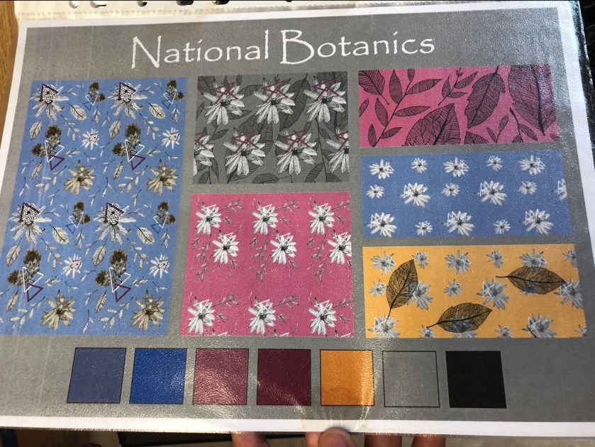
So as seen above my first collection is a stretch from my last, the hero pattern is blue instead of purple, and the purple printed out as a bright ugly pink. I comment that was suggested to me first of all was the last blender pattern was too detailed, and therefore became more of a secondary pattern, which worked out for the best, as I was advised to replace the pink secondary pattern as it did not produce a very good repeat and I agreed with this as there was far too much blank space on show each time it repeated, as well as now there was a fortunate gap for a new blender, which I was advised to fill with a pattern that was geometric instead of using florals again like the rest of the collection.

I also thought about the grey background, and considered that it could be distracting away from my designs as a whole, so I knew my next one would have to be changed to a lighter colour, even white, to be effective to show off my background images.

I felt myself when going back to my moodboard, that it was predominantly purple and yellow alongside my more neutral colours, with blue as more of an accent colour within the moodboard. So having my hero, a secondary and a blender as having blue backgrounds was something I thought I could reconsider. Having changed the final design to a light purple was really interesting, and I think worked well overall with the pattern, which had some small alterations too, such as enlarging the size of the thistle type motif which I think helped to change it up a lot.

IMG_0260

This was a more complete pattern collection that I was happy with, I think the colour scheme looks more efficient now and with the white background it gives it far more of a crisp clean feeling to it. The geometric pattern I think is a good touch to the collection however recent feedback means this will be altered slightly.

Charlie and Matt’s Digital Workshop

This was actually one of the best and information days we had this term in terms of being taught tricks on how to use the software. I covered this workshop quite well I think in my technical file, but I thought giving some thoughts on it here would be useful. They covered the techniques we had missed very well, especially the repeated pattern and the product mockups.

Product mockups initially looked a lot harder than they turned out to be, to achieve that professional level of looking like the pattern is actually on the product was not as hard as I thought it was. I ended up with around 6 different product mockups using my favourite patterns so I had a choice to put some in with my technical file and others as my main ones to go up on display.

Voyage – Fabric Samples

IMG_0286

Voyage was a little known company to me, however the single sample I received was later than the others, but worth the wait. The fabric had that rustic feel to it but still with a very good quality to it. I liked the style of the florals, almost giving a medieval type of appearance similar to that of William Morris if we were to zoom into his designs. I think overall this was a good sample to see for the high quality of it but I do not think this will be something that inspires me to change my work at all.

Digital Stitch

This was something I was really looking forward to as we did not have much opportunity to stitch this term apart from bits I did by myself at home, I thought about the design I wanted to do after doing the basic workshop to learn the techniques on it which I think was very beneficial and easy to understand.

IMG_0065

I really liked the motif fill especially so I knew I was going to use this and I also liked the effect of the turning angle fill as well as it produced this shine to it in the unusual shapes used in some of the leaves so I thought I could also use this.

IMG_0120

This is the design I ended up producing on the software, using a circle fill for the centre of the flower, a motif fill for the petals with an border around and initially the leaves were done with a turning angle fill but it was advised to me that the leaf actually did so little turning it might as well be done as a satin fill so this is what I changed it to instead. I also spent a long time changing the anchor points to ensure I did not have that many so the work was more structured and flowing.

I was happy with the final results and it was a great experience watching the digital machine going for it by itself, I was able to learn how to change over the colours and the bobbins and even reverse it when the stitch went wrong for a few lines so I was glad to have these skills in preparation for next year.

Zoffany – Fabric Samples

This one was quite difficult to get the information on as I could not find any information beyond the Style Library site that now owns it. It was described as fusing luxury with art in a sophisticated way which I think is a good way of describing it as the patterns and designs on the fabrics are very intricate and detailed but do not have such a Arts and Crafts feel to them as maybe William Morris does. The sample I have received is printed onto a sacking type of material, which gives it a more rustic and interesting look and feel to it, the colours have come up really bright on the light fabric particularly showing off the reds, oranges and teals within the work.

IMG_0282

The first ever collection that Zoffany created was inspired by a reproduction of historic wallpapers and coverings from Temple Newsam, which is a single old country home in Leeds. The name does not indicate this at all, you would expect it to be a foreign country and a more interesting place, however the designs do work well and the traditional style is a good one. The ‘Hallmark of Integrity’ papers collection is a popular one.

Zoffany create wallpapers, fabrics, trimmings, paints, carpets and furniture that all add to their wide portfolio of collections within style library as well.

Repeated Patterns

This was something else I found I was having to self teach myself from videos I found mostly on YouTube, however I found I was struggling with illustrator videos as the people demonstrating were mostly using a lot of shortcuts instead of showing the longer way to do it which I did not think was very good for an instructional video to a potential beginner on the software. I could have used the shortcuts too however I did want to learn exactly what the shortcut was to, and that was difficult considering the demonstrations were taking place on a Mac and I was using Windows, so of course the shortcuts were different to what I was trying to do.

I began to just experiment by myself using Photoshop and managed to create some interesting repeat patterns, very simple but just starting to get the hang of the software.

I was actually quite happy to look back at these patterns after completing more as these are actually quite bright and fresh, however I think overall I would like to go in a more muted direction with my designs as I feel like with the lines of the actual designs being bold and black I did not want my design to be overpowering.

I also had some accidents which went too far, however I thought it would be interesting to put in as an experiment such as this background repeat that did not quite match up, and this pattern that I defined and then added as a filled background behind the pattern as well.

Harlequin – Fabric Samples

Harlequin is part of a collection of brands I found on ‘Style Library’ that distributed the samples to me, this website also include Zoffany and Sanderson that I will be looking into next. These companies are also part of the Walker Green Bank group, which is an international luxury company that designs and manufactures wallpapers and fabrics alongside some interior products too.

Harlequin is a high fashion designer brand, incorporating wide fusions of colour and innovative textiles skills. The actual meaning of Harlequin is ‘varied in colour or decoration’, which suits this company well, I went to order floral patterns however the company do a lot more than just florals and I found them to be a very good company to look into.

They use digital design technology in their work which is something I think is great as this is what I will be doing in order to create my own collection as well, however a lot of the initial ideas are designed using watercolours or inks and paintbrushes to get the inspiration for the proper patterns to be created on a computer system. They claim to have strong links to manufacturing, due to the sharing of a factory site with the wallpapering side for over 30 years.

A collection that I quite liked and gained a lot of positive reception from is the ‘Momentum’ collection, which was first launched in 2011 but continued to be popular to this day, it is described as having a ‘Hotel-chic’ image to them.

IMG_0281

Fabric Samples

As this was a digital unit, there was not much need for manual print and stitch samples, however this is something that I really enjoy so that was definitely something I wanted to do, even if they were just simple and testing out some layouts on the fabric.

I really enjoyed printing with the apples on paper in my book, so I thought I would carry on with this kind of thing on the fabric using foam to print the designs onto fabric, as I liked the effect of not having a perfect exact print every time. While I do not think any of the samples are the best things I have ever produced, I liked that I had the time to produce some fabric this term and got to play around with felt as well as thinner fabrics I usually work with. I think if I had more time I would have liked to use cyanotyping as it can produce digital looking results by using the acetate with a photo printed onto it, so I could have experimented well with the blueprint type pattern as well as stitch alongside it.

Wednesday 2nd May Blog Update

Constellation was finally submitted today, it was not a rush as I had completed most of it for my last tutorial on Thursday, but I was glad to finish it down to the small things that I left for tonight. I happened across another artist’s work from Fine Art which was very relevant to my essay content, so this was a late addition to the initial paragraphs that I wrote. Now that this is done, I feel like I can throw all my focus into my digital matters module and get on with my patterns and sketchbook.

My blog has not been as active as I would have liked due to time constraints, so I will finally get around to finishing and posting my drafts.

To Do List

  • Patterns – Last critique stated my hero pattern was not as contrasting as some of my others, and as the flowers are mainly black and white and my background is a muted colour, I need to experiment with making these flowers more contrasted, so rather than a muted grey colour, making them far more white to see how that would look. Geometric tertiary pattern was liked however the triangles could use more detail, so rather than a plain triangle with the pattern around it, trying out a bold triangle outline with the pattern expanding behind the shape as well, and maybe playing around with another colour within it.
  • Product Mock ups – As the workshop was missed due to Steve’s illness, I am hoping for a catchup session, otherwise I need to find videos to show exactly how to do this.
  • Sketchbook – filling in gaps where needed, such as paintings, botanic dome pages and physical patterns.
  • Digital Stitch – print out notes from moodle and ensure I know what I will be doing before the first session, and also find out exactly which sessions I need to be going to.
  • Technical file – Catch up on half drop pattern pages and insert all the patterns I have tried while creating my other ones.
  • Blog – Finish and post my research pages, workshops and technical information, as well as photograph my sketchbook pages and show them.